⚙️ General Tab
The General Tab controls the core settings and behavior of an Element.
These settings define how the Element behaves at runtime and how it is interpreted inside the page workflow.
The General Tab will adapt depending on the element type.
Some elements include additional controls (for example, text inputs include validation rules), while others keep the tab minimal.
Important:
Element-specific settings are documented in the Website Elements reference section.
This page describes the shared settings that appear across most elements.
🧱 Shared Settings
These settings commonly appear in many types of Elements.
| Setting | Description |
|---|---|
| Label / Name | A human-friendly title used to recognize the Element in the builder. Does not display to end users unless the Element itself shows it. |
| Default Value | A starting value assigned when a page or workflow loads. Helpful for Yes/No controls, dropdowns, text fields, or informational states. |
| Optional | Allows this Element to be skipped during workflow progress. Useful for non-required questions or optional user inputs. |
| Required | Forces the user to provide an input before progressing. If enabled, validation occurs at runtime. |
| Minimize | Collapses the Element so only the top header row is shown. Keeps pages clean when content is long. |
| Minimize Height | Sets how tall the Element appears when minimized. Default is typically 30px. |
| Read From Source | Pulls the Element's value from a variable or data source from other page/tile/element. Ideal for dynamic content. |
| Functions | Applies reusable actions to the element (e.g., reset, update value, toggle visibility). Used in advanced interaction workflows. |
🖼️ Example: Yes / No / “If necessary” Choice Field
Below is an example of how some of these shared settings look inside the General Tab.
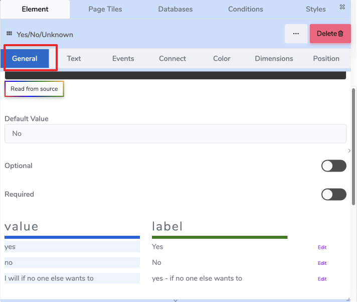
Default Value
The default selected option when the page loads.
Optional / Required
- Optional → user may skip answering.
- Required → page cannot continue until a selection is made.
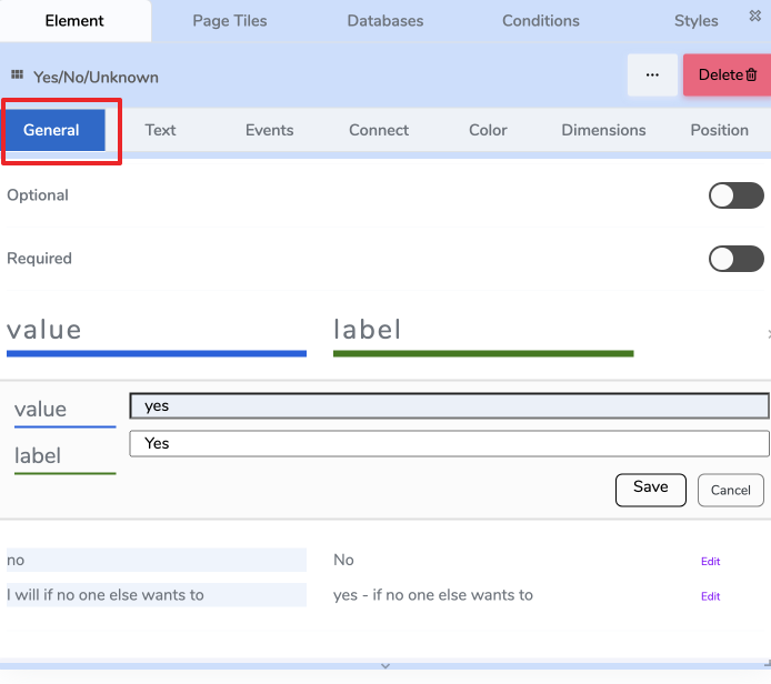
Options Table
Some Elements (like Yes/No/Unknown lists or dropdowns) include a Value / Label table:
| value | label | actions |
|---|---|---|
| yes | Yes | Edit |
| no | No | Edit |
| i will if no one else wants to | yes – if no one else wants to | Edit |
- Value is used internally in logic and variables.
- Label is what the end user sees.
🔄 Element-Specific General Settings
Some settings only apply to certain Element types.
Examples:
| Element Type | Example Element-Specific Setting | Where to Learn More |
|---|---|---|
| Text Input | Input Type (text/email/number), Placeholder | See Text Input Element |
| Image | Image Source, Upload vs URL | See Image Element |
| Signature Field | Signature Canvas Style | See Signature Element |
These are documented in the Website Elements section, not here.
🧩 Functions (Computed Actions)
Functions are small, reusable computations.
They read inputs (element values, variables, constants), process them, and write an output (to an element or variable).
They don’t run by themselves — use the Events tab to decide when to call them (e.g., on change of qty, on load, on submit).
Think: inputs → function → output target
🔌 How to Wire a Function
- Inputs: choose one or more sources (e.g.,
element:qty,var:unitPrice, constant0.07). - Function: pick a computation (e.g.,
CALCULATE_PRICE). - Output: choose where the result goes (e.g.,
element:total,var:orderTotal).
🗂 Computed Functions (Web v1)
A focused set of useful, non-generic building blocks.
Element-specific functions (e.g., table row ops) are documented on the element’s page.
Pricing & Numbers
| Function | Purpose | Typical Inputs | Output |
|---|---|---|---|
| CALCULATE_PRICE | Line total with quantity, discounts, and tax. | unitPrice, quantity, discount? (abs or %), taxRate? | number |
| AGGREGATE | Sum/avg/min/max over a list (e.g., items). | list, field, op (`sum | avg |
| ROUND | Round to given decimals or step. | value, decimals?, mode? (`half_up | floor |
| PERCENT_OF | Compute X% of Y. | percent, of | number |
Example (CALCULATE_PRICE)
Inputs: unitPrice=var:unitPrice, quantity=element:qty, discount=var:promoPct, taxRate=0.07
Output → element:lineTotal
Lookups & Mapping
| Function | Purpose | Typical Inputs | Output |
|---|---|---|---|
| LOOKUP | Return a value from a key/value list or object. | source, key, path? | any |
| MAP_LIST | Transform each item by rule. | list, rule (expression) | list |
| FILTER_LIST | Keep items matching a rule. | list, rule (predicate) | list |
Example (LOOKUP)
Inputs: source=var:pricingTable, key=element:sku, path="price" → Output → var:unitPrice
Dates & Durations
| Function | Purpose | Typical Inputs | Output |
|---|---|---|---|
| DATE_ADD | Add days/months/minutes. | date, amount, unit (`days | months |
| DATE_DIFF | Difference between two dates. | start, end, unit | number |
| FORMAT_DATE | Format for display. | date, pattern | string |
Text & IDs
| Function | Purpose | Typical Inputs | Output |
|---|---|---|---|
| CONCAT | Concatenate with separator. | parts[], sep? | string |
| NORMALIZE_TEXT | Trim, collapse spaces, lower/upper. | text, mode | string |
| GENERATE_ID | Short, URL-safe identifier. | prefix?, length? | string |
Validation Helpers (return booleans or messages)
| Function | Purpose | Typical Inputs | Output |
|---|---|---|---|
| MATCHES_PATTERN | Regex/format check (email, phone, etc.). | text, pattern | boolean |
| WITHIN_RANGE | Numeric/date bounds. | value, min?, max? | boolean |
| REQUIRED_IF | Conditionally require a field. | condition, value | boolean |
Results from validation functions typically write to a variable (e.g.,
var:isValidEmail) or a message element.
📌 Summary
- The General Tab defines the role and behavior of the Element.
- It contains a mix of:
- Shared global controls → documented here.
- Element-specific controls → documented in the Element Reference section.
- Values displayed here affect runtime behavior and workflow progression.