🎨 Floating Design Panel
When you start creating a web page, a template, a tile, or adding a single element onto the canvas, the Floating Design Panel emerges.
This panel is your central workspace for configuring and customizing your project.
🪟 Modes of the Panel
1️⃣ Element Mode
- Full secondary tabs are available: General, Text, Events, Connect, Color, Dimensions, Position.
- Shows currently selected element type (Text Label, Text Area, Button, Image, etc.).
- Floating and draggable, so it can be placed anywhere on the screen.
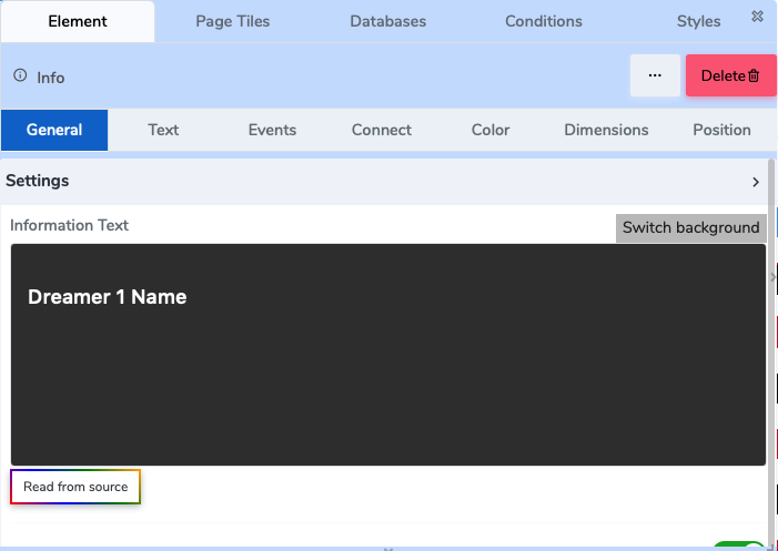 Figure 1: Floating Design Panel in Element Mode
2️⃣ Page / Tile / Instance Mode
- Only top-level menu is visible:
Element | Page Titles | Databases | Conditions | Styles | ❌ Close | 🗑️ Delete - Secondary-level tabs are hidden.
- Users can select a tile instance from the panel to work on.
- This mode allows editing the page structure or tile instance instead of individual elements.
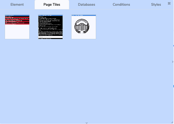
Figure 2: Floating Design Panel in Page/Tile/Instance Mode
🧭 Top-Level Menu
At the top of the Floating Design Panel, you’ll find:
Element / Tile / Page Title & Type
Shows the name of the currently selected element or tile, and its type.Menu Tabs
- Element – core settings of the element or tile
- Page Titles – manage titles or references
- Databases – connect to stored or dynamic data
- Conditions – attach conditional logic (show/hide, triggers, gates)
- Styles – access styling controls
Utility Buttons
- ❌ Close – dismiss the panel
- 🗑️ Delete – remove the current element, tile, or page
📂 Secondary-Level Tabs (Element Mode Only)
When editing a single element, the panel shows these additional tabs:
- General – element basics and properties
- Text – font, size, formatting (if applicable)
- Events – define actions or triggers (click, hover, submit)
- Connect – link to external or internal data sources
- Color – background, text, border colors
- Dimensions – width, height, spacing, padding
- Position – alignment and layout control
Tabs vary depending on the element type. A “Text Area” will show different options than an “Image” element.
🔗 Next Steps
- Learn about Element Controls
- Explore Conditional Logic
❓ Need Help?
If you have any questions, please don't hesitate to
contact us.
Alternatively, you can submit an issue on our
GitHub platform.