Slider Element
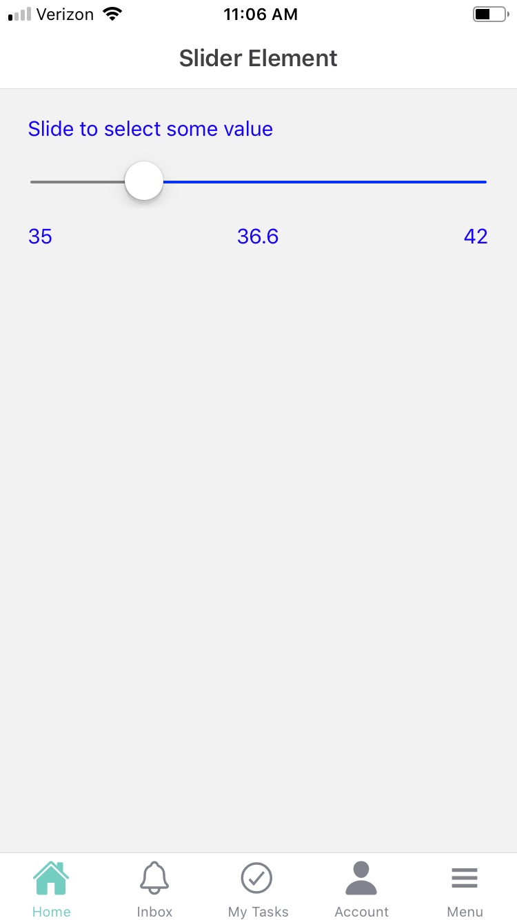
The Slider element is used to select a value from a predefined range or scale using a sliding control. Slider elements can be used in both Forms and Cards to allow users to select a value on a sliding scale. For example, a slider could represent numbers from 1 to 100. The element is designed to accommodate a variety of device types and screen sizes. You can also use options to customize the appearance of the slider, such as changing the color or width of the slider bar.
The slider element has the following attributes:
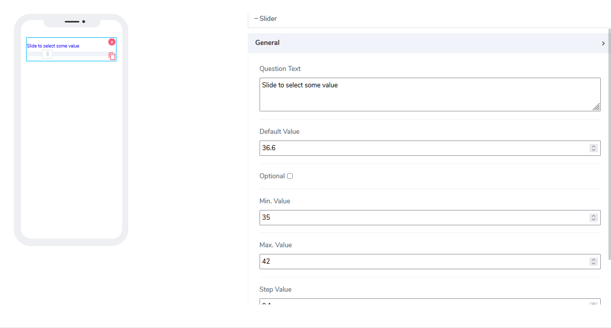
Question Text: A freestyle, multiline text field that indicates to the end-user what information they need to input.
Default Value: By default, this element is optional and can be filled in at design time or run time via the calculated field function (see below).
A default value of 36.6 is assigned to help the user understand what this value represents.Optional: Indicates whether the element is mandatory to be filled in at run time. By default, this is not selected and therefore the element is mandatory.
Min Value: Indicates the starting point for the slider's visual representation.
Max Value: Indicates the ending point for the slider's visual representation.
Step Value: Indicates the value of one unit on the slider scale.
When using Slider elements in Acenji, keep these tips in mind:
To use the Slider element, simply slide the control in the direction specified to select your desired value. You can refer to the expected scale or range provided to make your selection.
Please note that the selected value should fall within the predefined range or scale, and should be compatible with any other form elements or calculations that may depend on it.
To ensure accuracy, there may be validation rules in place to limit your selection to a specific range or scale. Additionally, you may have options to adjust the granularity of the slider control, allowing for finer or coarser adjustments depending on your desired level of precision.
Questions?
If you have any questions, please don't hesitate to contact us.
Alternatively, you can submit an issue on this platform.
Useful Links:
Avada Theme Documentation - https://theme-fusion.com/documentation/avada/
Avada Video Tutorials - https://theme-fusion.com/documentation/avada/video-tutorials/
Avada Demos - https://theme-fusion.com/avada-demos/