Card List Element
A Card List element allows you to present a list of items or content in a visually appealing way that makes it easy for users to scan and select the items that interest them. Card List elements can only be used within Cards. They are perhaps the most fundamental elements for cards and focus on providing various functionalities that can help users navigate between apps or within the same app. It is particularly useful for presenting a collection of items that have a similar structure, such as products or articles. We will demonstrate some use cases where card lists consolidate and display information from other apps, trigger events, or pass information to other elements. They can be edited, cloned, or deleted at runtime and are 100% dynamic. Their functionality is usually divided between events and functions.
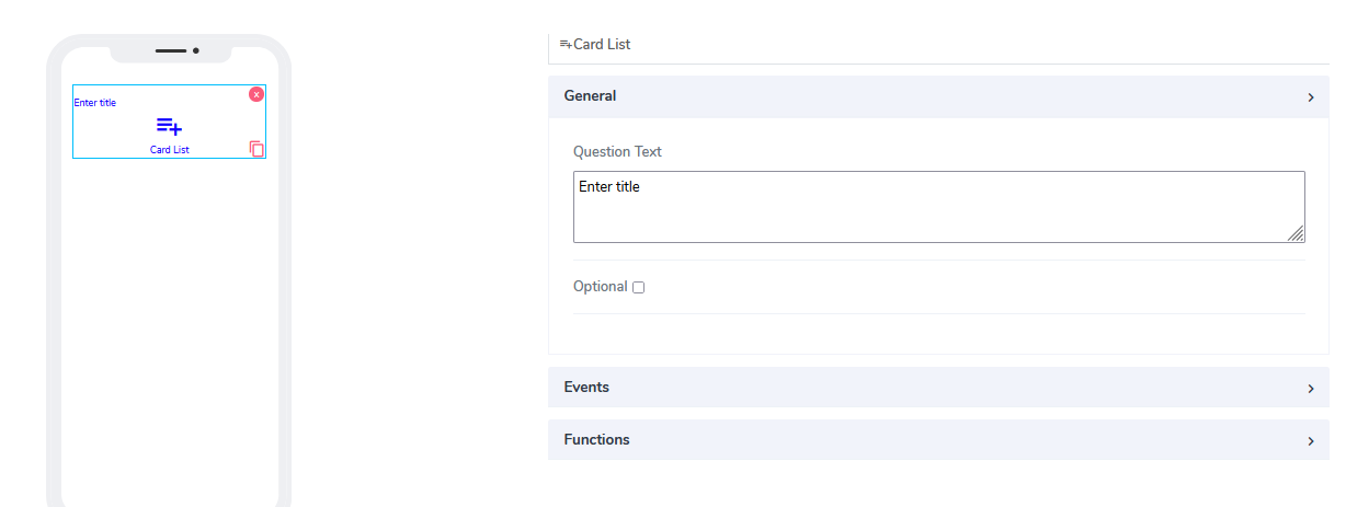
Card List comes with the following attributes:
Question Text: Freestyle, multiline text. The text field is read-only and indicates to the end-user what action will follow if they press the button.
Optional: Indicates if this element is mandatory to be filled in at runtime. By default, this is not selected, and therefore the element is mandatory.
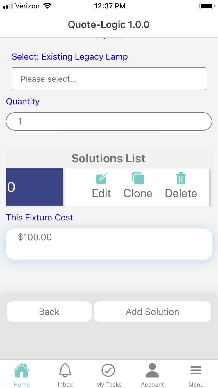
Events: Provides the ability to connect to the same card or a different card and define what action to expect from it. Ideally, this works as a bridge between cards. By default, the following events are built internally: Edit, Clone. The delete event needs to be defined in advance here.
When the card list is presented on mobile, to access the events, swipe to the left.
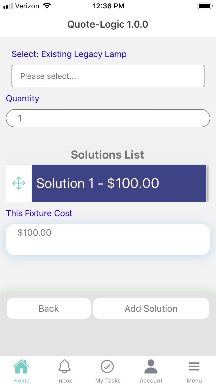
- Functions: An endless number of functions can be added via selection here. For a start, the user needs to add related cards in the card relationship box.
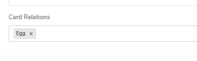
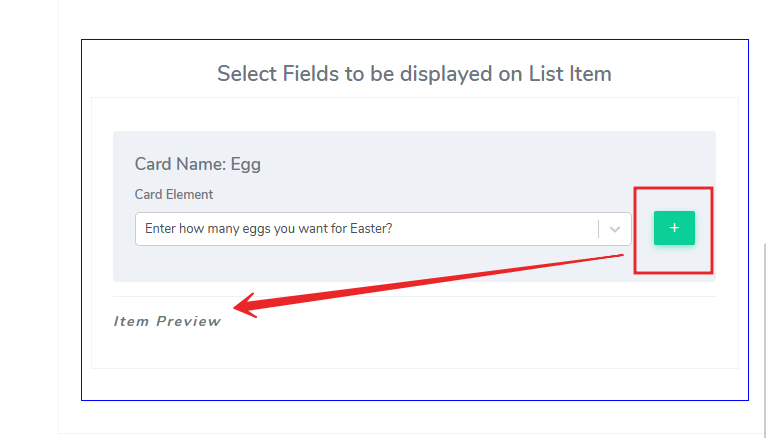
Then, under Actions, add the card that will have a relationship via the card list. In our example, we will use a previously defined small card called Egg. Since the idea is to bring information from the other card (in the example Egg), we can specify what elements to use and use the calculation fields mechanism to define a very complex workflow if needed.
When using card list elements in Acenji, keep these tips in mind:
The card list element is a way to display a list of items in a visually appealing and organized manner. To make it easy for you to find what you're looking for, each card should have a clear and consistent layout, font, and color scheme. Each card should also contain enough information about the item, such as a title, description, price, or other relevant details, to help you decide if you want to click through to learn more.
To make the list more interactive, the cards can include buttons or links that allow you to take action on the item directly from the list. For example, you might be able to purchase a product or read an article by clicking a button or link on the card.
To make it easier to navigate long lists of items, the card list can use pagination or infinite scrolling. This can help to improve performance and make it easier for you to find what you're looking for.
To make the list more useful and relevant to your needs or interests, the card list can be integrated with other elements such as search or filtering. This will allow you to narrow down the list based on specific criteria, making it more personalized and helpful for you.
Questions?
If you have any questions, please don't hesitate to contact us.
Alternatively, you can submit an issue on this platform.
Useful Links:
Using the Slider Element - https://help.acenji.com/#/./elements/slider/index
Using the Signature Element - https://help.acenji.com/#/./elements/signature/index
Learn about the Rich Editor Element - https://help.acenji.com/#/./elements/rich-editor/index